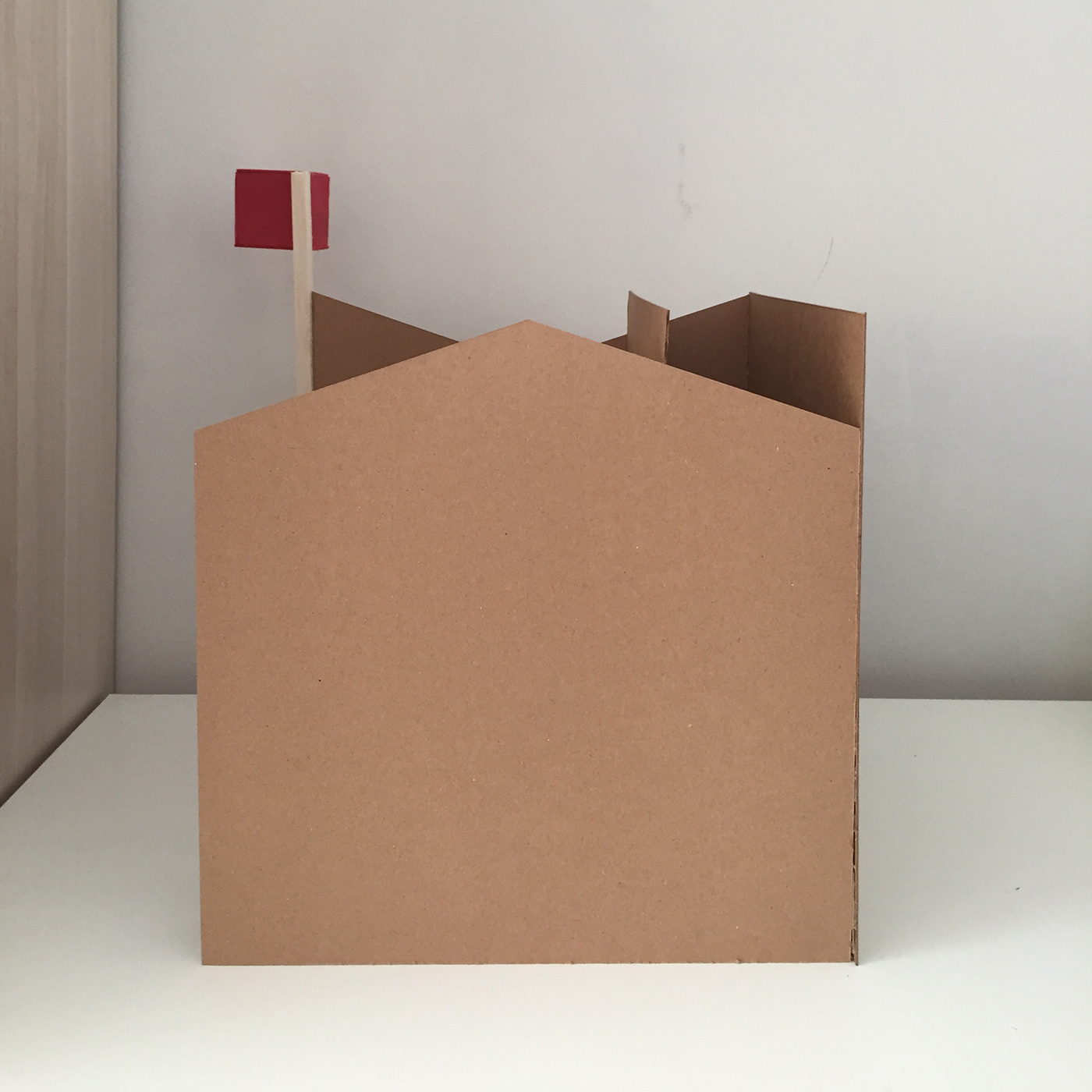


The Vanna Venturi House designed by Robert Venturi was the biggest inspiration for me while I was designing my cube.
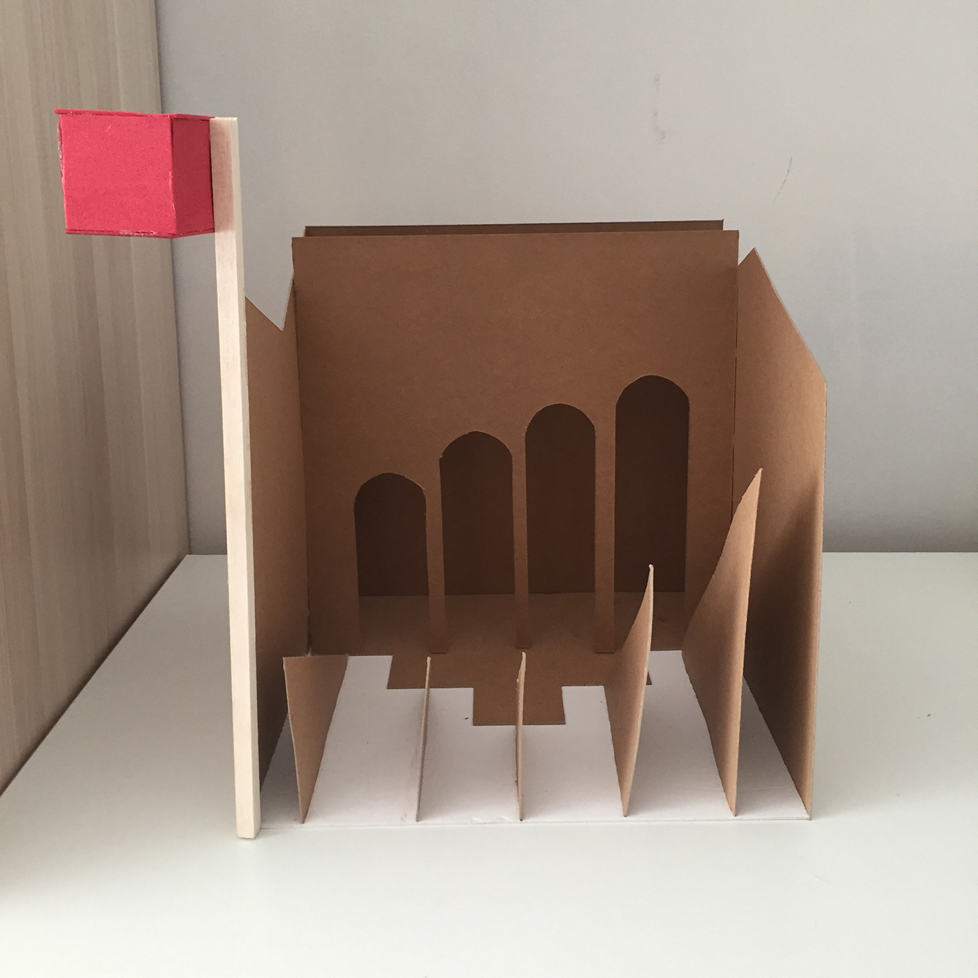
My cube has a sign next to its façade. Venturi & Brown argued about symbols and signs in their book called Learning From Las Vegas. They created two understandings in the approach of the buildings: “duck” and “decorated shed”. Duck is when the ornamentation is the whole building: it is something that is a big, clear part of the building. For example, TWA Terminal in New York City by Saarinen that looks like a bird with open wings can be an example of “duck” in the modern architecture. Decorated shed is when the ornament is not the whole building, but in its small parts such as its façade. Venturi highlighted the importance of façades, signs and symbols because these can be used in architecture as a communicative tool. So, I put a sign outside my cube that says that it is a cube brutally. By doing that, I tried to combine the “duck” and “decorated shed” idea. Normally, either the building itself is the ornament (for ex. in the shape of a duck) and sign just tells about its function (“a store that sells poultry”), or the building is designed in a proper way (for ex. like a box) and the sign/façade gives the idea about what it is (duckshaped façade or a sign that includes duck photos, etc). But this time, sign says it is a cube and when you look at it, it really is a cube, so I tried to bring a playful approach to design by doing that. I tried to give the feeling of the architects’ approach by creating diversity in each façade. The triangles that used in the interior side of the cube creates the main façade of the cube by their edges. They create an asymmetrical, vertical façade. When you look at the triangles from the top, their edges with their placement remind you the interior staircases of the Vanna Venturi House which stars wide, then narrows and widens as you go up.
In the interior of the cube, there are arches arranged side to side that look like it’s another façade of the cube: but actually, it is not. I wanted it to look like a façade design that includes historical references. But I placed it inside to create an irony and complexity in design, that Venturi has used in his designs.
Side surfaces of the cube are also different from each other. One is like a section of a pitched roof house, the other one has the missing parts of it to become a square.


